A completely contrasting background is a substrate question
On this page6
What the words are doing
The statement has to appear on a completely contrasting background. On a printed label applied to a bottle, the background is the label stock and the ink on it, and contrast is entirely in your control. The rule is easy to satisfy and easy to forget about.
Where it gets harder
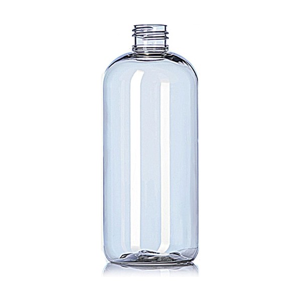
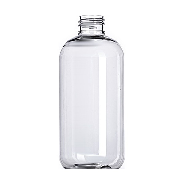
It gets harder the moment the container itself is part of the design. A clear label on clear glass means the background is whatever liquid is behind it, and that changes between a pale botanical and a dark cola. A decorated bottle, a frosted finish or a sleeve means the background is the decoration. In each of those cases contrast is a property of the pairing rather than of the label alone.
Which is why the liquid colour belongs in this decision
A producer whose product is almost colourless and who wants a clear label on clear glass is relying on the printing to carry the contrast by itself, against a background that is effectively the shelf behind the bottle. That is the one case worth being conservative about, and an opaque panel behind the statement solves it cheaply.
And why amber is not automatically the answer
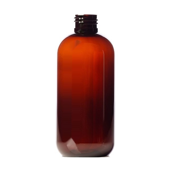
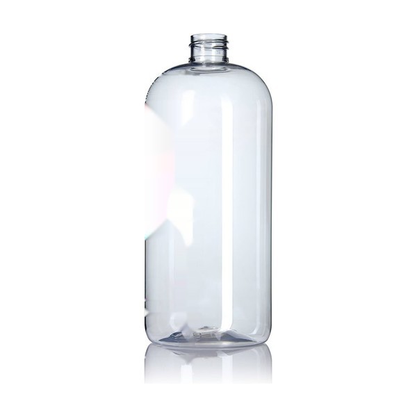
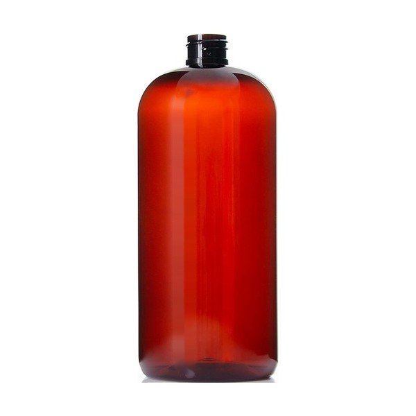
Amber glass or amber PET gives a consistent dark background, which makes contrast straightforward, and it also hides the drink. For a category that sells partly on looking like the thing it replaces, that is a real trade rather than a free win. The shelf carries clear and amber in both materials, so the choice is available either way.
Shrink sleeves move the problem rather than solve it
A full-body shrink sleeve gives you a printable surface over the whole bottle, which looks like it ends the contrast argument. It does, but it also means the artwork now wraps a compound curve, and type that is legible on a flat proof can distort over a shoulder. If the required statement lands in a distorting zone it may be adjacent and contrasting and still not readily legible, so place it on the straight section.