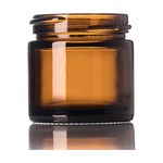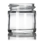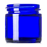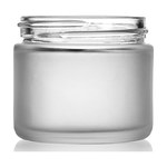
How it looks on a shelf
Updated
On this page6
Skincare is one of the few categories where the packaging carries most of the price justification, and where the most protective choices are frequently the least attractive ones.
The category is sold on restraint
The visual convention is spare: a lot of empty space, small type, muted or no color, and the product name stated plainly. That convention is not arbitrary. It signals clinical seriousness, which is what a customer paying a premium for a serum is buying.
Which means the temptation to add, a pattern, a second color, a claim, usually costs more in perceived credibility than it gains in shelf presence.
What has to be legible
The product type, so a customer can find it in a row of similar bottles. The size, because serums vary and the price comparison depends on it. And the key active if the product has one, because that is what people search for.
The rest of the mandatory copy, the full INCI declaration and your address, does not need to compete for attention and cannot be omitted for design reasons.
The conflict with protection
Clear glass shows the product and lets light degrade it. An airless pump protects the contents and looks more industrial than an apothecary bottle. A small pack keeps the product fresh and reads as poor value next to a larger one at a similar price.
Every one of those trades is real and only one direction is reversible. A brand can explain why its bottle is opaque; it cannot explain a browned serum.
Consistency across a range
A range that reads as one family occupies more shelf and more memory than the sum of its parts, and it is the cheapest presence a small brand can buy.
The way to get it without compromising protection is to hold the label system constant and let the container vary: same typography and layout across a 30 ml amber dropper, a 50 ml airless pump and a 200 ml cleanser bottle. The family is in the label, and each product gets the pack its chemistry needs.
What the color of the container does