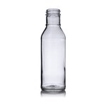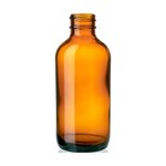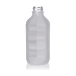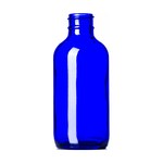
How it looks on a shelf
Updated
On this page6
A retail shelf is a row of five ounce woozy bottles that are all the same shape. Everything that distinguishes yours happens in a few square inches.
You are competing at three feet
A customer scanning a shelf reads at distance and at speed. Whatever is smaller than about a centimeter is decoration, not communication, and the elegant thin typeface that looks good on your desk disappears at three feet.
Print a label, tape it to a bottle, and stand back. That is the only test that matters and almost nobody does it before ordering a print run.
The front panel does one job
Say what it is and whose it is. Everything else, the story, the heat description, the provenance, belongs on the back where a customer who has already picked it up will read it.
Crowding the front with all of it is a common small producer mistake and it makes the bottle harder to read rather than more informative.
Shelf reality
Bottles get turned, pushed back and put behind others. A label that only works face-on works less often than you think, so a wrap or a repeated element on the side helps.
Retail lighting is warm and bright, and it browns a red sauce in a clear bottle over weeks. The product a customer sees at the back of a shelf in month two is not the product you shipped.
What actually differentiates
Not heat claims, which every bottle on the shelf makes. Not Scoville numbers, which read as a dare to the wrong customer.
Specificity does: the pepper by name, where it came from, what it is for. A customer choosing between eight red sauces is looking for a reason, and "made with datil peppers from the county I live in" is a reason where "extremely hot" is noise.
What the glass or resin color does